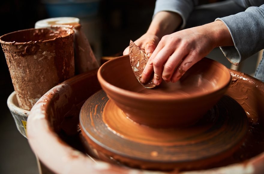
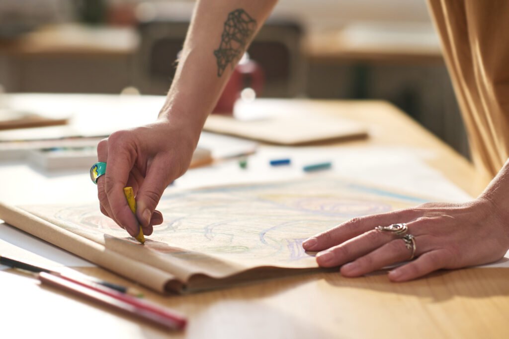
Have we Forgotten the ‘Timeless Principles of Design’?
I am still recovering from a recent shock!
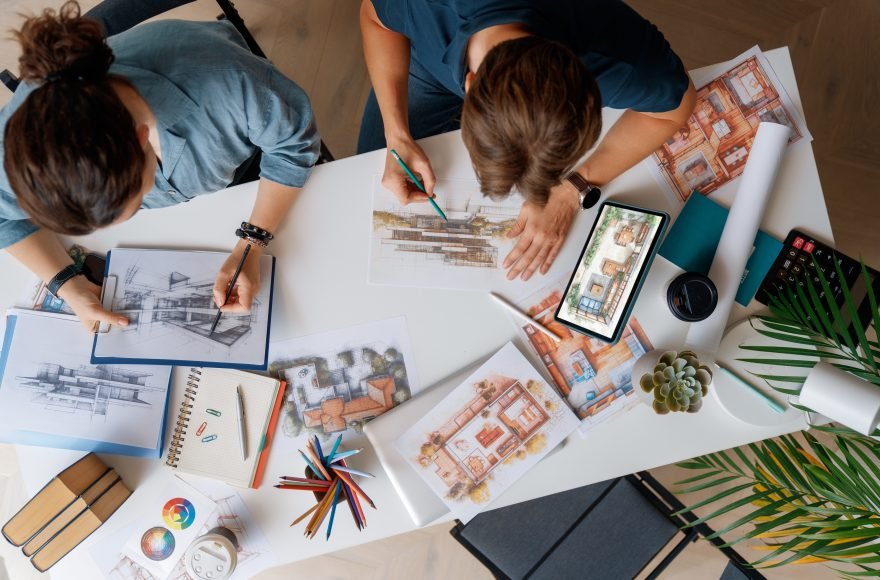
A client of ours decided to engage a ‘big-name aggregator’ for his home interior design, the home being designed by us at Creo. A good natured person that he is, he wanted our involvement and advice on the overall project and continues to honour our payments. The shock however is not about another professional entity taking over interior design of the home Architected by us!
It stems from the 160 plus slide deck of rendered images (by the aggregator) that have pure ‘Visual Violence’ contained in them. (*Notice the author struggling for polite words to describe the experience).
Even more shocking fact is that it is being designed by a ‘foreign educated’ (more precisely UK returned) Interior Designer. Now you know the reason for the shock and the inspiration for this Blog.
“Good design is actually a lot harder to notice than poor design, in part because good designs fit our needs so well that the design is invisible,”
— Don Norman, The Design of Everyday Things
It burns our heart to see that the renders originally proposed by us were very sophisticated in comparison (a lot more minimal inspite of being pompous). Oh, did I mention we produced an equal number of renders and revised them a few times based on client’s need – for ‘wow factor’ before the advent of the ‘aggregator’?
We would have been honestly delighted, if the invading interior designer faired better than us and would have learnt our lessons in the process.
Alas, the project is underway sadly with the 160 plus slide deck design, I referred to earlier. I am guilty of letting things slip out – after polite resistance, subtle hints and no-conflict. (My Professional peers say I should have fought like a Warrier to modify the clients’ taste :).
Today’s clients are well informed, they travel, have seen the world and have access to the internet more than anything else. Often we find ourselves in a tennis match of exchanging ‘pins’ and images with clients.
We ourselves are inspired by the instas’ and images (not to forget the enticing Reels) that we see. What is driving our ‘Design Taste’? This episode got us thinking about what is missing!
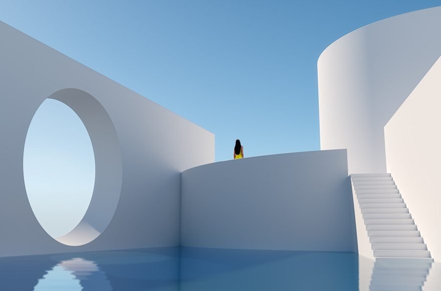
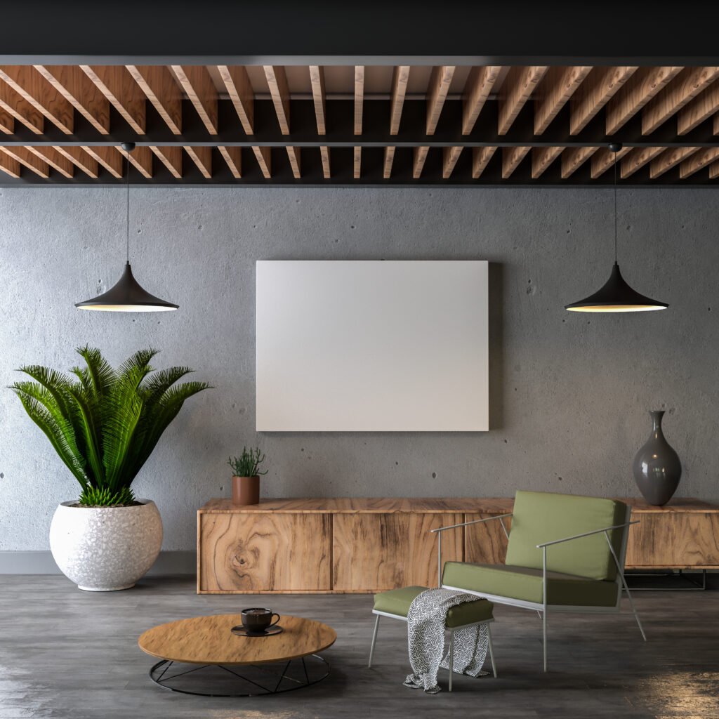
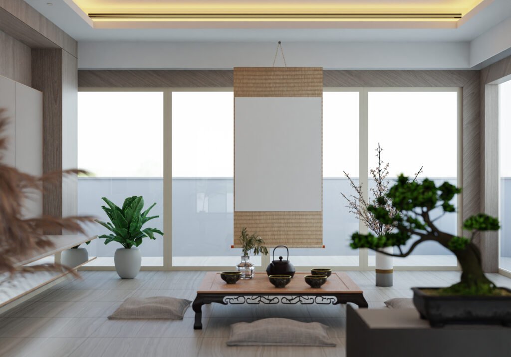
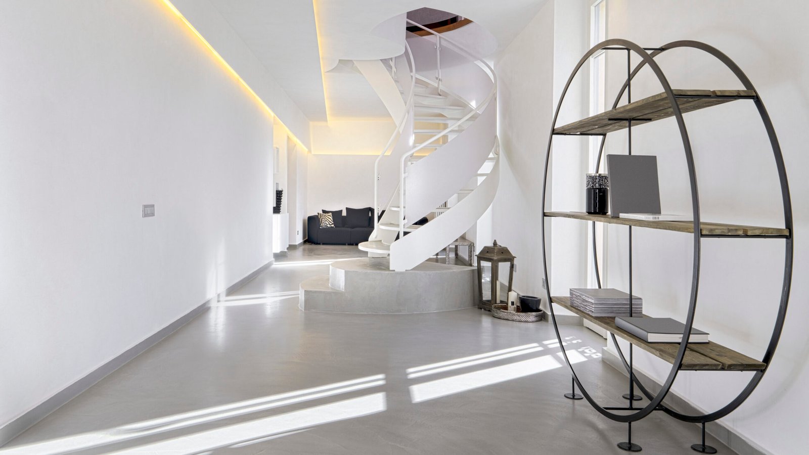
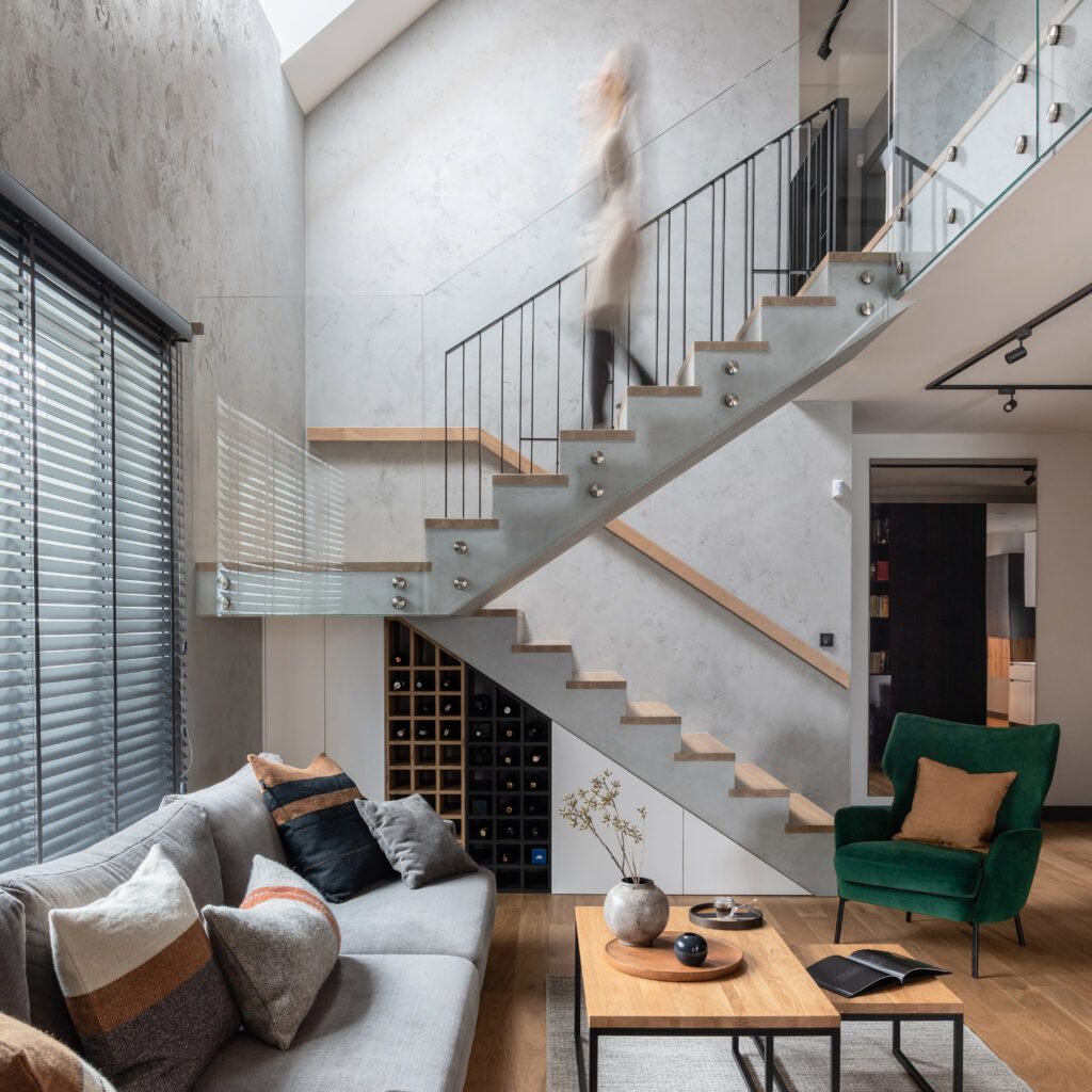
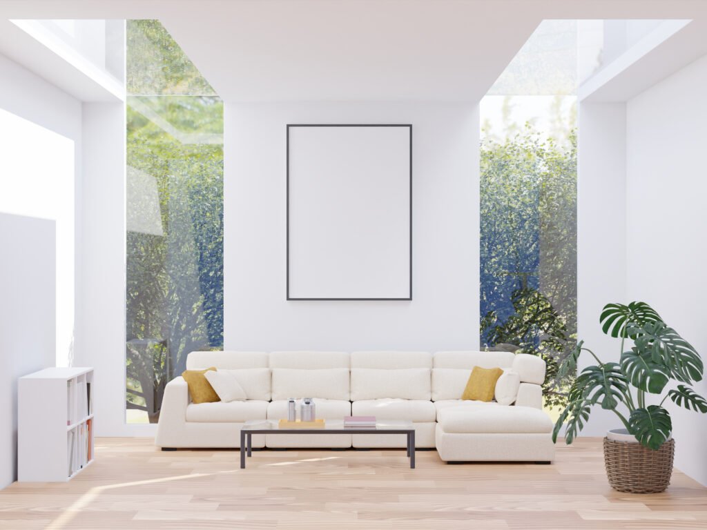
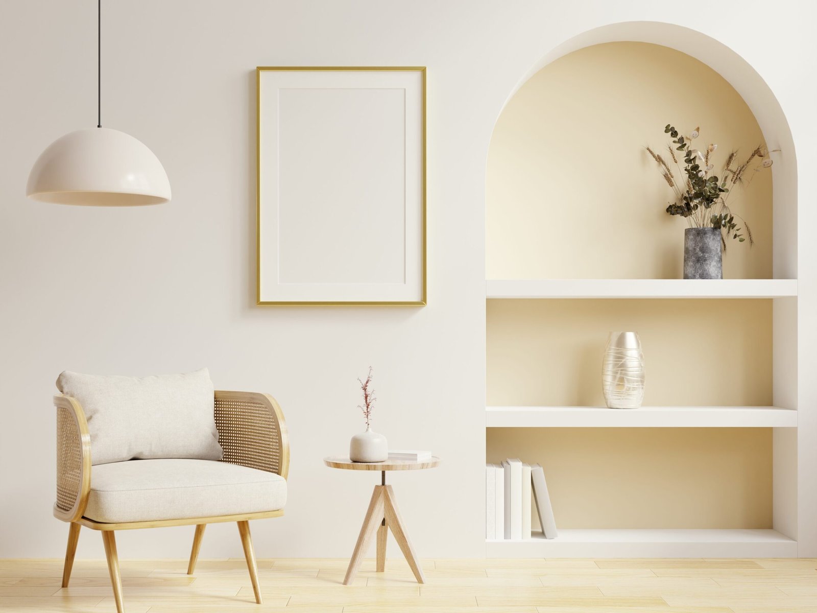
For better or for worse we find Design – all around us. Good design transforms how we experience the world.
Have we forgotten the timeless principles that underpin great design? In the greed to ‘wow others’ or follow (shall we say copy?) the latest ‘trends’, it’s easy to lose sight of the foundational principles that ensure a space is not only visually appealing but also functional and harmonious.
Let’s revisit these guiding principles and rediscover their significance in creating designs that stand the test of time.
“Design is not just what it looks like and feels like. Design is how it works.”
— Steve Jobs
This Blog is as much a reminder for me as it is for readers, so it is kept brief and simple.
Much is written about the ‘Design Principles’ that are Universal for all Design disciplines and they vary in numbers. However I find the following 12 relevant, drawing from my early Architecture School days upto the recent searches. Let’s attempt to get the spirit of the Principles beyond words.
1. Alignment: The Foundation of Order
Alignment ensures that elements line up in relation to one another, giving a clean and organised look. Whether it’s furniture placement, wall art, or architectural features, proper alignment creates visual coherence. Misaligned elements can make a space feel chaotic, whereas thoughtful alignment brings clarity and structure.
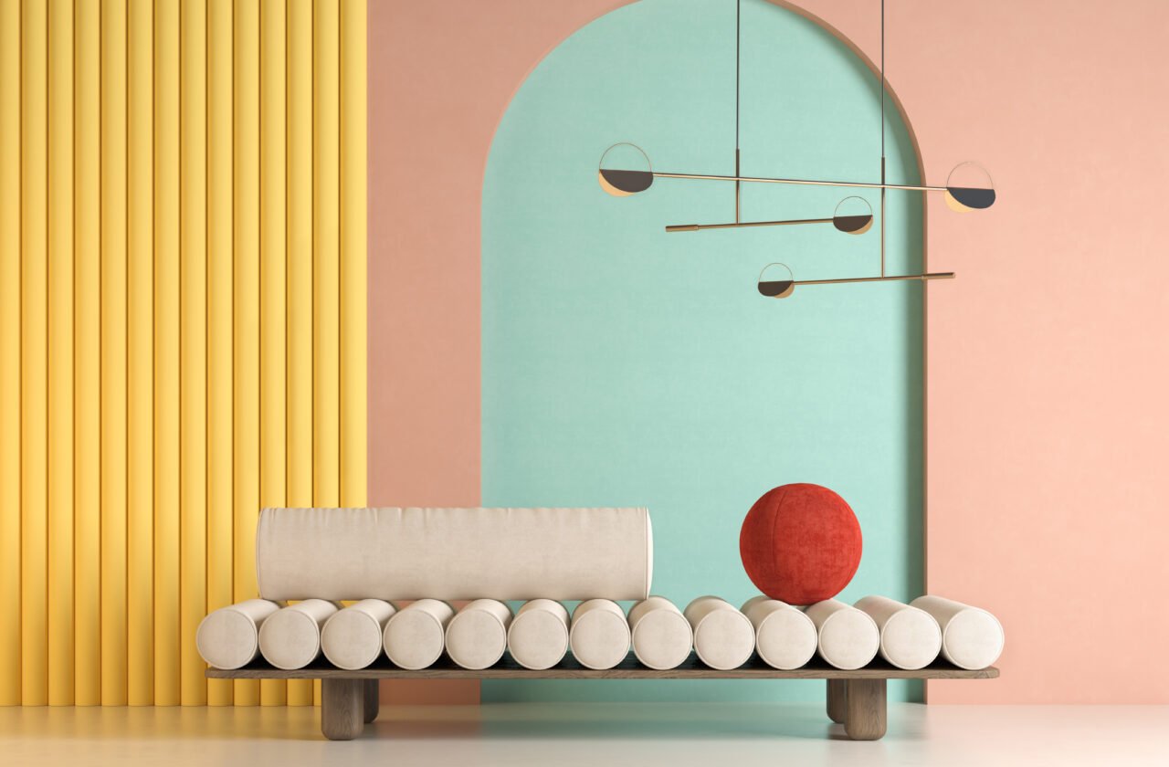
2. Balance: The Art of Equilibrium
Balance is about distributing visual weight in a space. It can be achieved in several ways:
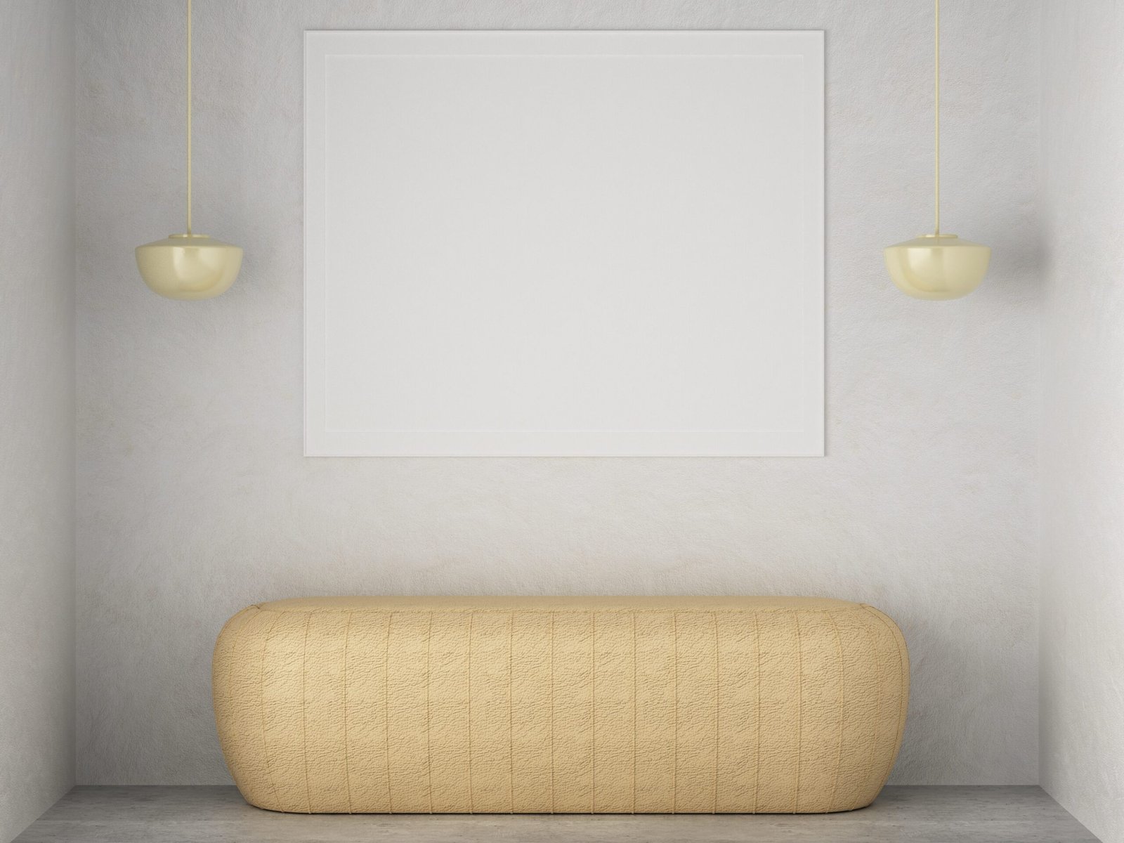
- Symmetrical Balance: Elements are evenly distributed on either side of an axis, creating a sense of stability.
- Asymmetrical Balance: Different elements are arranged to achieve equilibrium without mirroring. This creates a dynamic yet balanced look.
- Radial Balance: Elements radiate around a central focal point, often creating a harmonious flow.
- Horizontal & Vertical Balance: Achieving balance by distributing visual weight along vertical and horizontal axes ensures a well-proportioned space.
3. Contrast: The Spice of Design
Contrast highlights differences, making a design more engaging and dynamic. It can be achieved through:
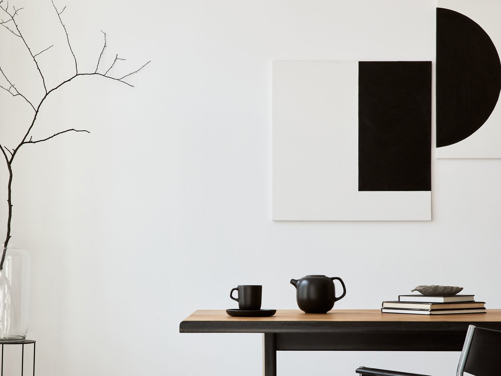
- Light & Dark: Pairing contrasting tones for visual drama
- Smooth & Rough: Juxtaposing textures to add depth
- Simple & Complex: Balancing minimalism with intricate details
4. Emphasis: Commanding Attention
A focal point or Emphasis ensures that one element dominates, drawing the eye and creating interest. This could be a bold-coloured sofa in a neutral room or a dramatic light fixture in a minimalist setting.
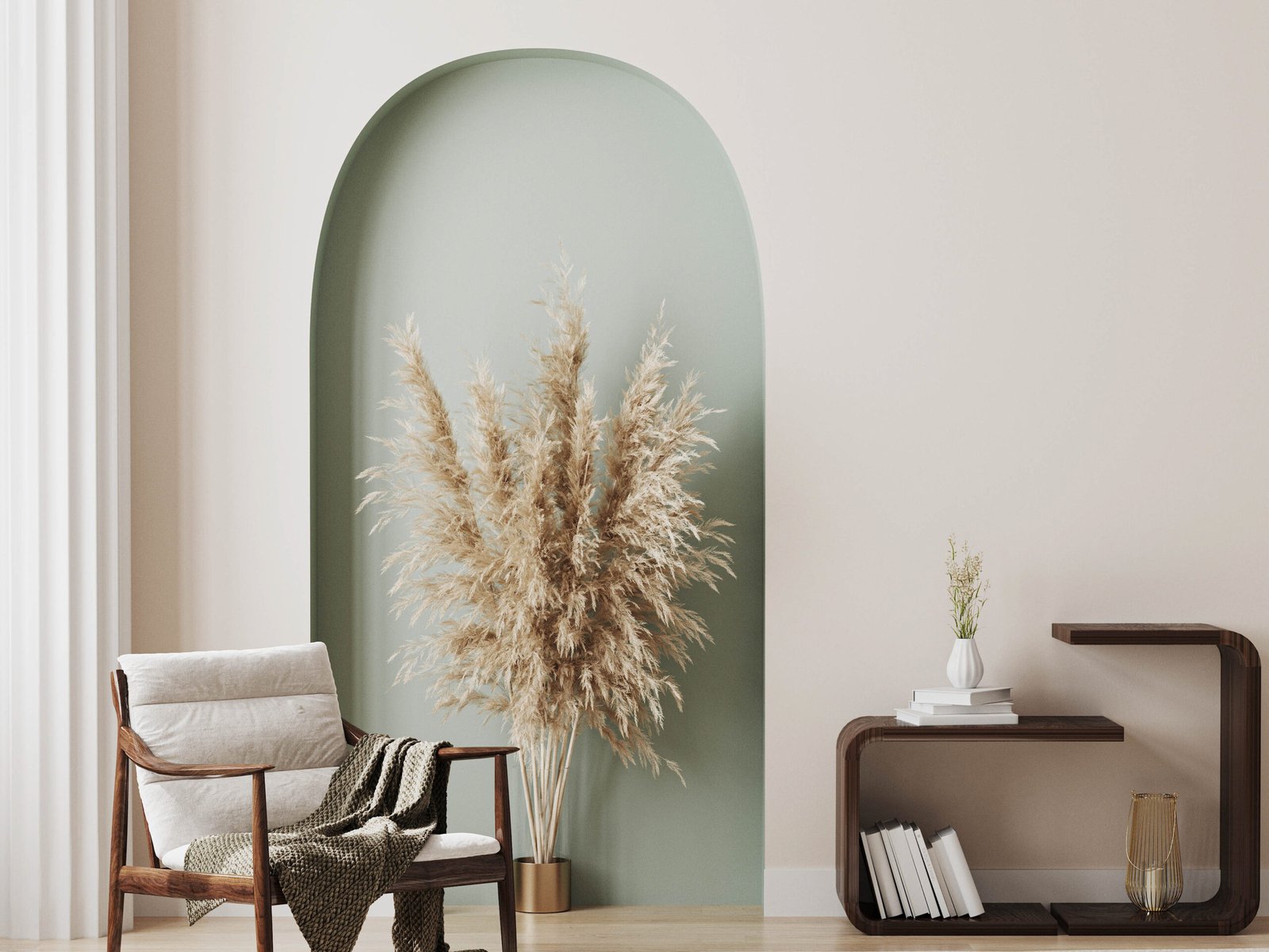
5. Harmony: A Symphony of Elements
A pleasing relationship between different elements in a space. When colours, textures, patterns, and shapes work together, the result is a unified design that soothes the senses rather than overwhelming them.
6. Hierarchy: Communicating Importance
Organising objects and elements to guide the viewer’s attention. Larger, bolder, or contrasting elements naturally draw the eye first, followed by secondary details. This principle ensures transition within the design’s message or makes functionality clear.
7. Movement: Guiding the Eye
Movement in design creates a visual path that leads the viewer from one element to another. This can be achieved through:
- Transition: Gradual changes in color or texture
- Line: Using lines to direct attention and create a sense of flow
8. Proportion & Scale: Getting the Size Right
Proportion and scale ensure that elements relate harmoniously to one another and the space as a whole:
- Proportion: The relationship between sizes and shapes within a design
- Scale: The size of objects relative to each other and their surroundings
9. Rhythm: Creating Patterns in Motion
Rhythm brings a sense of continuity and flow to a design. It can be achieved through:
- Repetition: Using the same element repeatedly.
- Progression: Gradually changing an element’s size, shape, or colour.
- Alternation: Systematically alternating between two or more elements.
10. Solids & Voids: Balancing Mass and Space
The interplay of solids (forms or masses) and voids (white space or emptiness) is essential in design. Solids bring visual weight, while voids provide breathing room, enabling elements to interact effectively.
11. Unity: The Cohesive Whole
Unity integrates all elements of a design into a seamless whole. When colours, textures, patterns, and shapes are in sync, the result is a space that feels complete and purposeful.
12. Variety: Breaking the Monotony
While consistency is key to unity, variety ensures a design doesn’t feel monotonous. A well-placed deviation—like a pop of colour or an unexpected texture—adds interest and vitality.
Conclusion: The Timelessness of Principles
How much is too much?
Everything that is in excess is poison – Swami Vivekananda
The principles of design are rooted in human perception and experience. When deployed judiciously and with caution they are a guide for creating spaces that are not only visually appealing but also functional, balanced, and harmonious. By revisiting these fundamentals often, Architects and Designers can craft environments that transcend trends and resonate deeply with those who inhabit them. Clients and end-users may need to be educated in these (within the modest fees received) for better manifestation of Design.
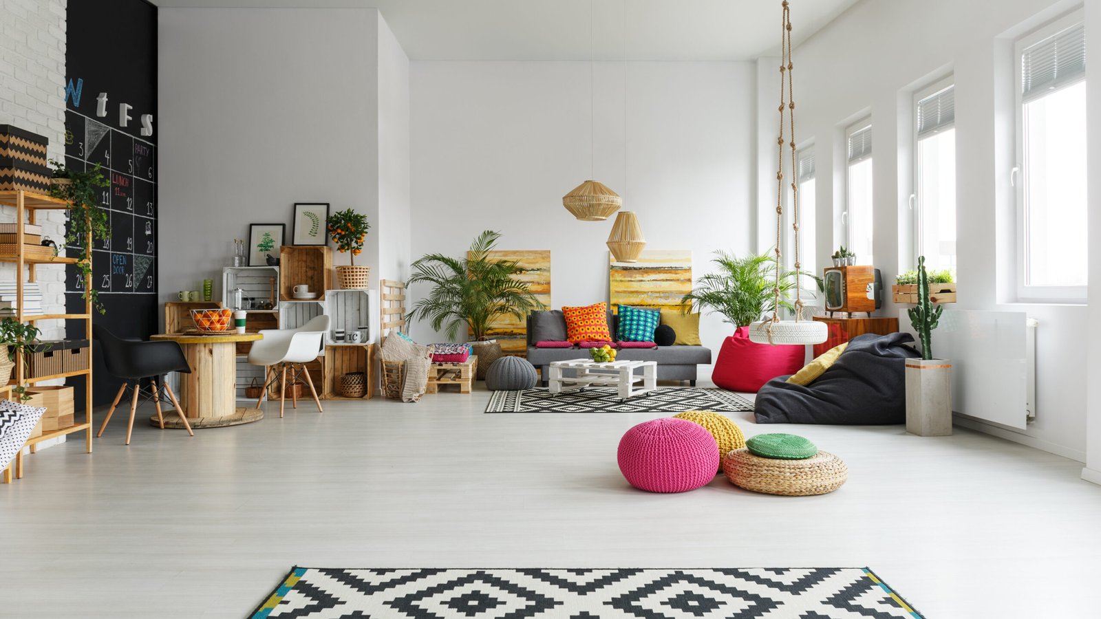
There is a stronger need today for us to be educated on these and use them judiciously in Designs that are not a ‘Visual Khichdi’ (Indian Hindi word for a porridge like dish) leading to Diarrhoea of spatial experience. In a world of fleeting fads, can we return to these enduring principles? Is Great design about following trends or is it about creating spaces that feel just right—today, tomorrow, and always!
Article By: Sathish Desai, Principal Architect & Designer at CREO, Bengaluru
Disclaimer: The content in this article is from the author’s personal experience and his learning from various resources. It is intended to inspire and help people in their own design journey. Please do leave a comment or message me your thoughts!